Timeline
4 months
Client
360 Learning
Deliverables
Low / high fidelity mockups
Tests results
My role
Project Managment
Prototyping
Test
01
Introduction
360Learning is a LMS (Learning Management System) platform and offers an easy way to create, deliver, and improve courses through collaborative learning. Since 2012, the company has transformed more than 1,200 companies, mostly in France and in the US.
When I started as a Product Designer at 360Learning, the hot topic in the Product Team was “the new navigation”. The ambition was to drastically improve the UX on the platform and build a robust solution for the long-term.
The main complexity were the various roles, permissions and use cases. Authors want to create content, Admins want to check statistics, and learners want to consume content. Today, no matter the role, users arrive on the same home page, and it could be confusing because there’s a lot of information.
Also, when the platform was created, it was without any UX expert. No research has been done and as a result, the navigation is not intuitive and the company loses deals for this reason.
A squad was in charge of this project, but as it implies every squad, it was difficult to take decisions and communicate. As a new joiner, I proposed to crack the case and start working on this hot topic to:
- Define a clear vision with stakeholders
- Work with a “task-force” and propose a robust solution
- Define how to communicate with everyone and ensure we’re all on the same page
02
Workshop vision
We launched the project with 2 PMs and 2 designers (myself included) and started by organizing a workshop with stakeholders to define the vision and highlight the main problematics.
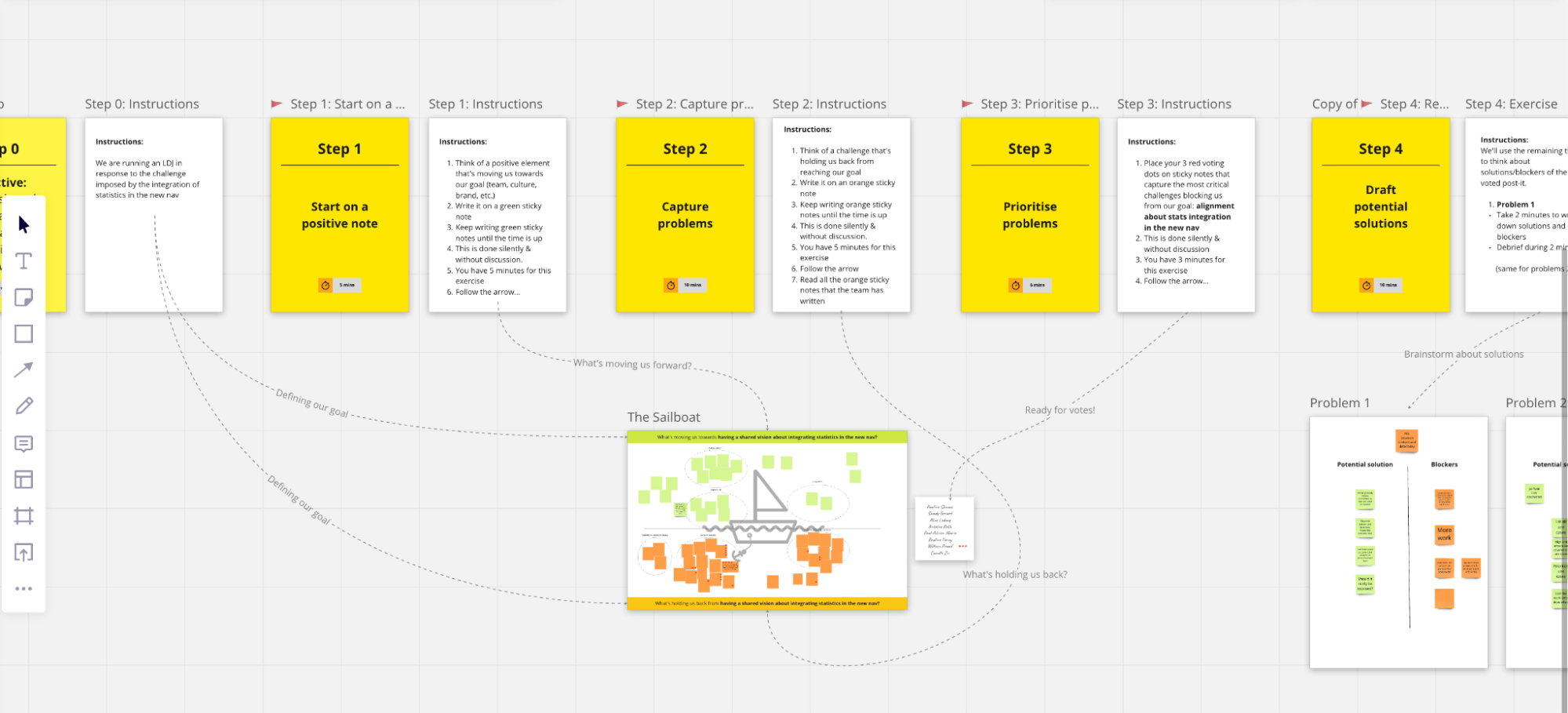
We used the "LDJ" (Lightning Decision Jam) framework, which is a type a workshop to solve big problems, it’s divided into 4 steps:
- What’s moving us forward?
- What’s holding us back?
- Votes
- Brainstorm about solutions
Screenshots of the Miro used for the workshop:
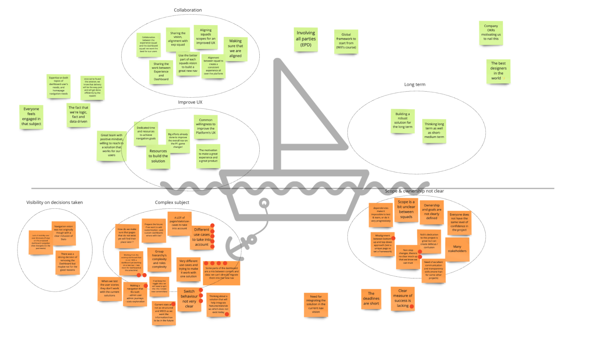
During the workshop, I grouped post-it into categories:
- Collaboration & visibility: need to share the vision between squads, lack of visibility regarding the subject, bad communication, scope and ownership is not clear
- Complexity: the subject is very complex and has many use cases, it’s difficult to build a robust solution for the long term
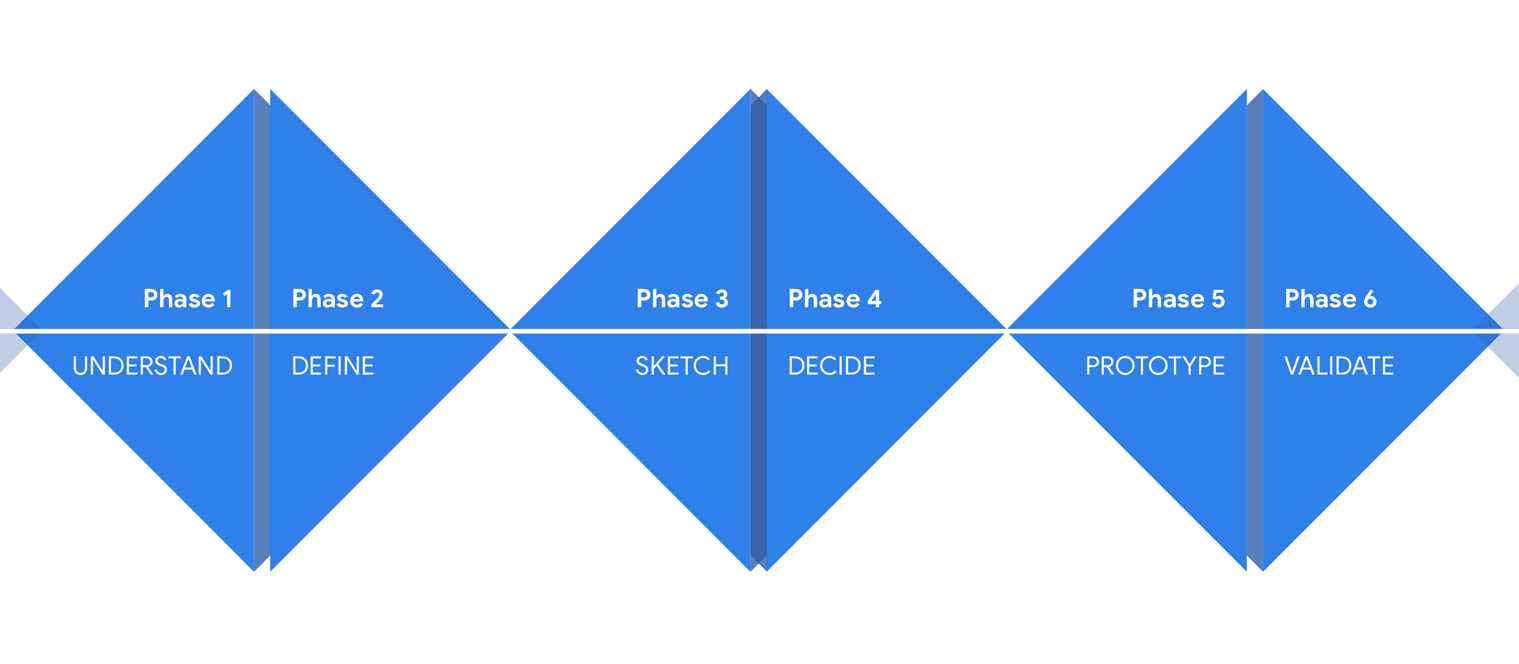
It helped the Stakeholders realize how complex is the subject and how it impacts all teams. We started working as a “task-force” with a clear deadline and transparent communication. The idea was to work like the “Design sprint” method but during 2 weeks, with the following objectives:
-
Understand & define the problem:
- Audit existing
- Analyze user insights
- Benchmark
-
Start to design solutions:
- Define a vision
- Internal / external tests
-
Prototype and validate:
- High fidelity mockups
- Conclusion
03
Understand the problem
1. Audit
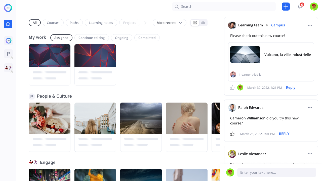
Today on 360 Learning platform, there’s the home page with some content, and a right panel always open, with activities related to the connected user.
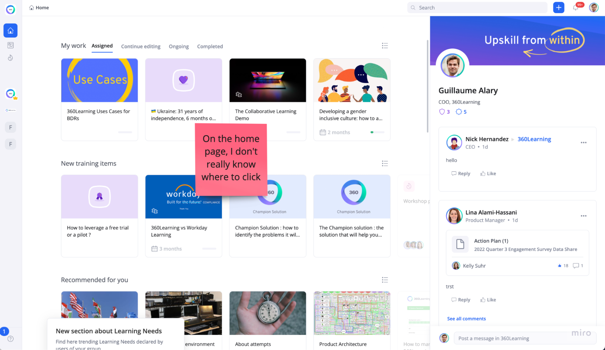
If the user clicks on the left menu, a sidebar opens with the possibility to click on “Dashboard”.
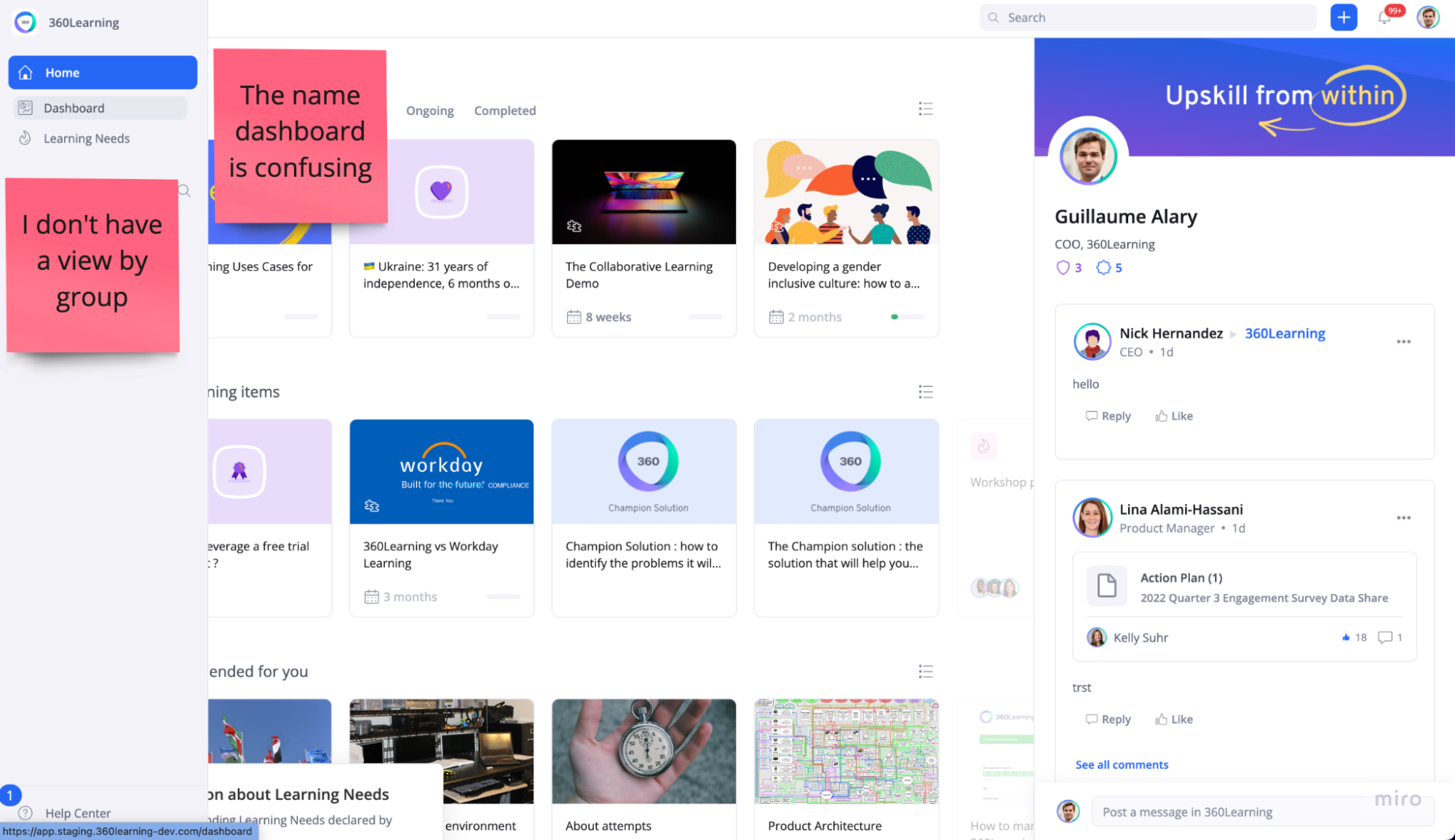
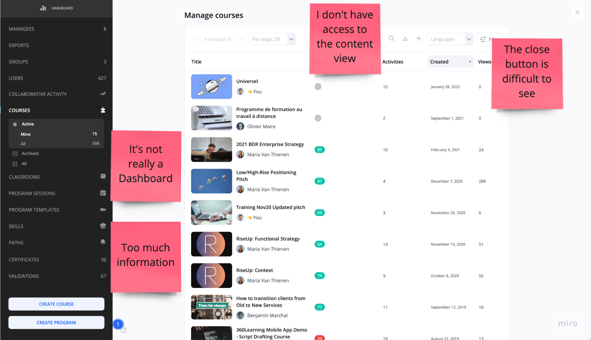
The “Dashboard” is not what users expect, it’s the place to manage, edit & play any object (courses/programs/users etc.). To go back to the home page, there’s a close button on the top right:
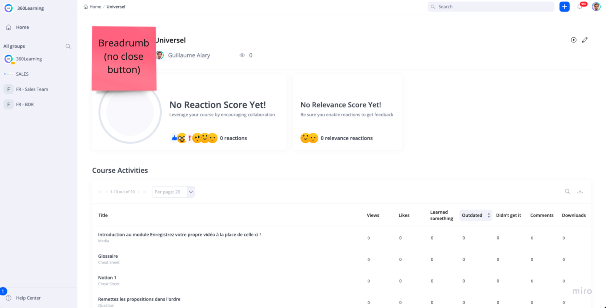
If the user click in a course, then there’s no “close” button anymore, but a breadcrumb, which can be confusing:
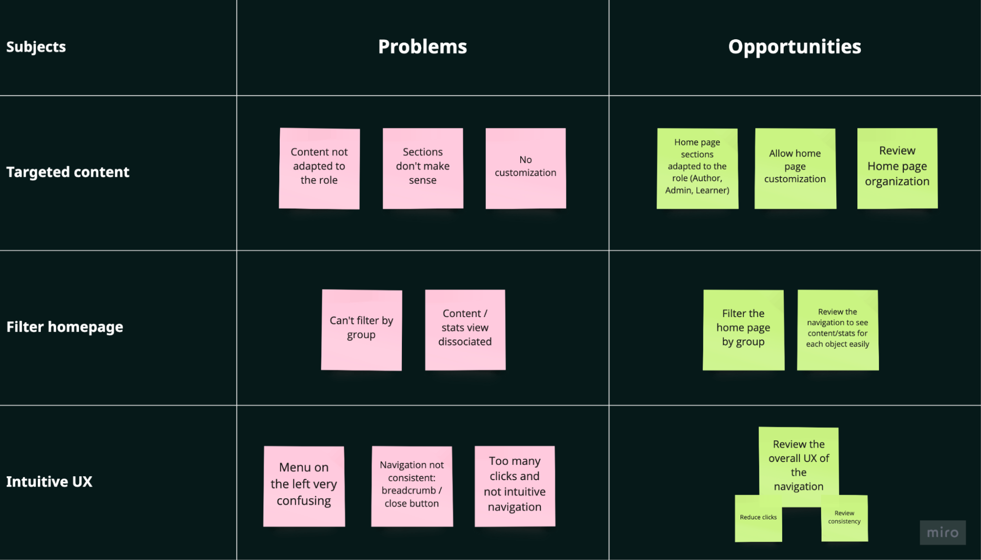
Recap: Problems & opportunities
2. User Insights
To collect user insights, we used 3 different methods:
- We sent a survey to users (internal and external) in order to collect as many responses as possible
- We gathered all the insights collected through “Harvestr” (a tool that centralizes user insights)
- We conducted 5 face-to-face interviews (small/medium/large companies)
In the end, we had a lot of insights from different roles: Learners, Admin and Authors. I tried to categorize those insights into 6 pillars, see screenshot below:
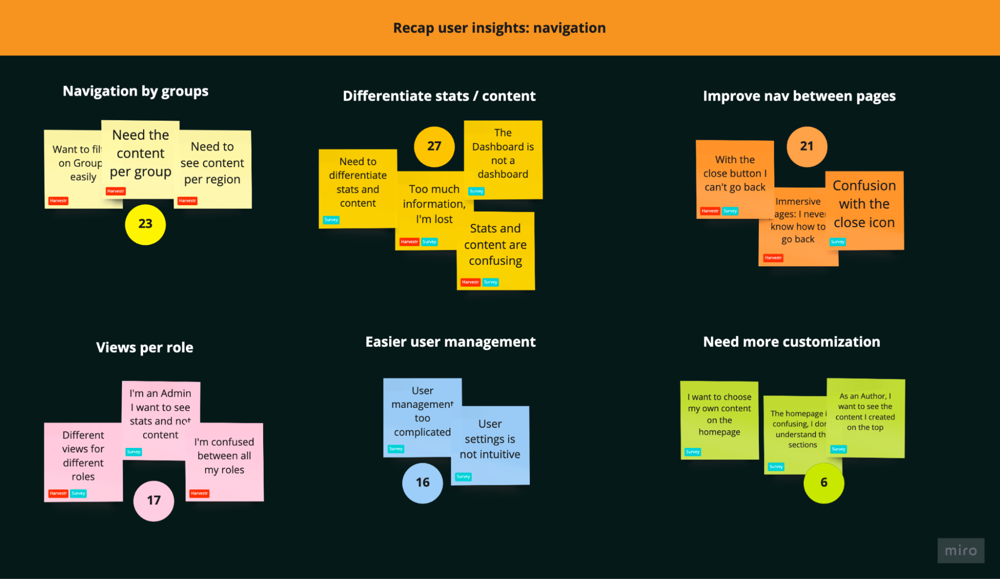
Navigation by groups: companies have different sectors (Product Design, Sales, Operations etc…) and on the platform, we call it “Groups”. One of the main need is to see content/stats by Group.
Differentiate stats/content: today, the left panel called “Dashboard” is a mix of content and statistics. It’s very confusing for users, they don’t know where to find information.
Improve navigation between pages: the navigation between pages is a mix of breadcrumbs, close button, or sometimes it opens a new tab. Users are lost and it’s frustrating.
Views per role: there are 3 main roles on the platform, Admins, Learners and Authors. The default content is always the same, no matter the role. Sections are confusing, and it’s not adapted to the need.
Easier user management: user settings are not intuitive today, it’s a common task for Admins, the access should be easier.
Need more customization: needs vary a lot depending on roles and company size, the home page could be customizable to answer all needs.
3. Benchmark
I did a quick UI benchmark and had a look at some tools such as Airbnb, YouTube or Uber Eats.
Airbnb

Youtube

Uber Eats

04
Start to design solutions
1. Vision
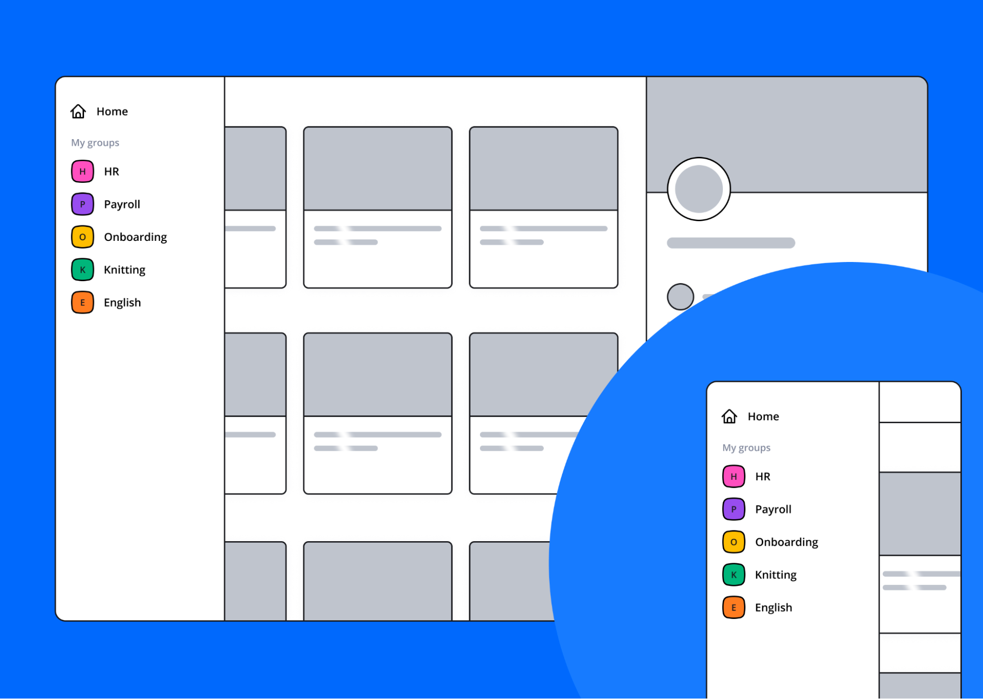
After sharing user insights with stakeholders and developers, we had a clear vision of what to do. We organized some workshops with the “task force” dedicated to the new navigation, and we came up with a “vision” of the new navigation.
Only “Home” and “my group” access in the left menu:
Content default view is for training needing attention and recos:
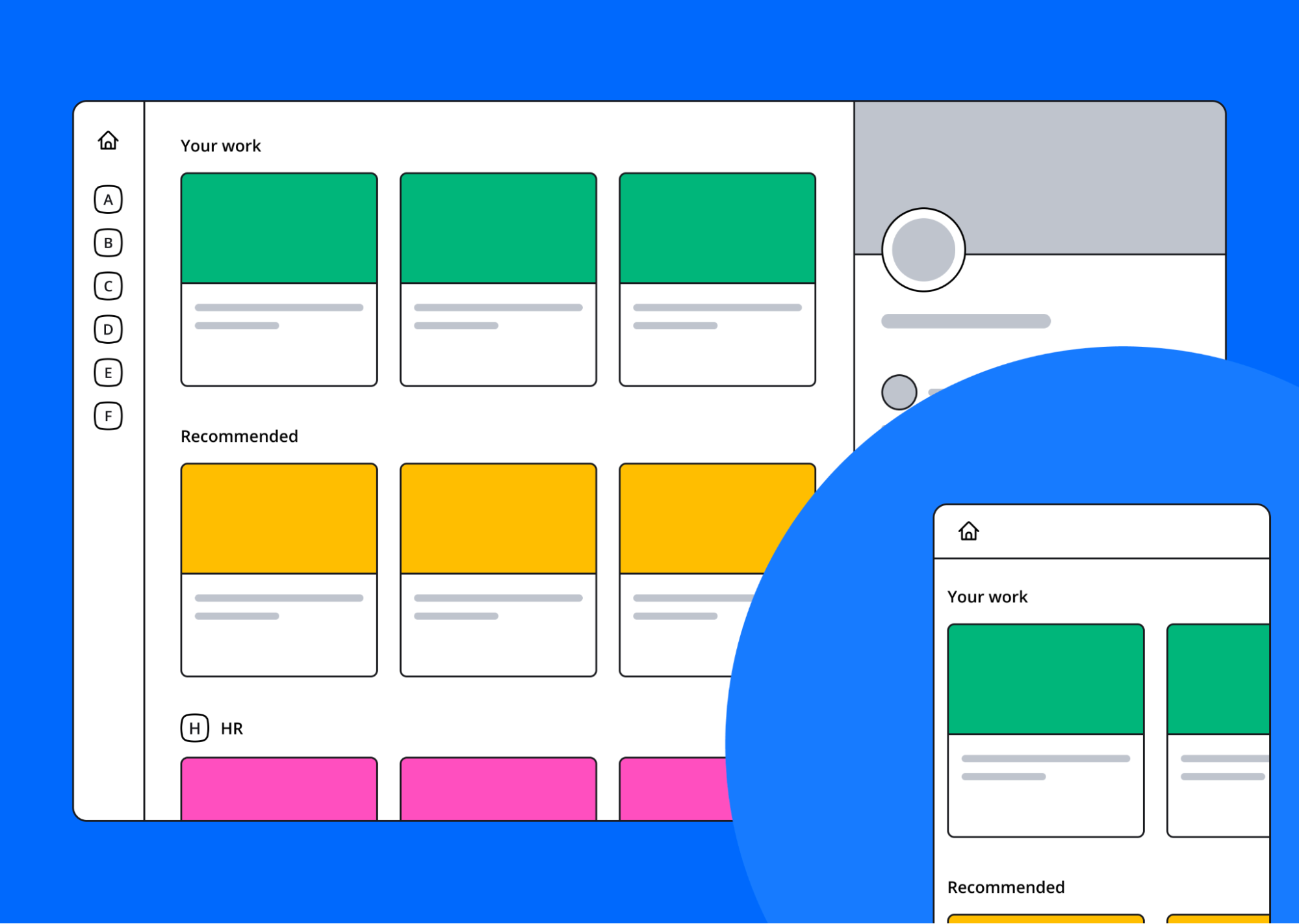
users have a clear view of what's expected from them and ongoing work. Sections and their content push the most relevant training. Second step is to display a homepage needed by the user:
- Depending on role (content default for learners, dashboard user for user admin...)
- Depending on habits: filtering and sorting preferences
Chip filter view on one object:
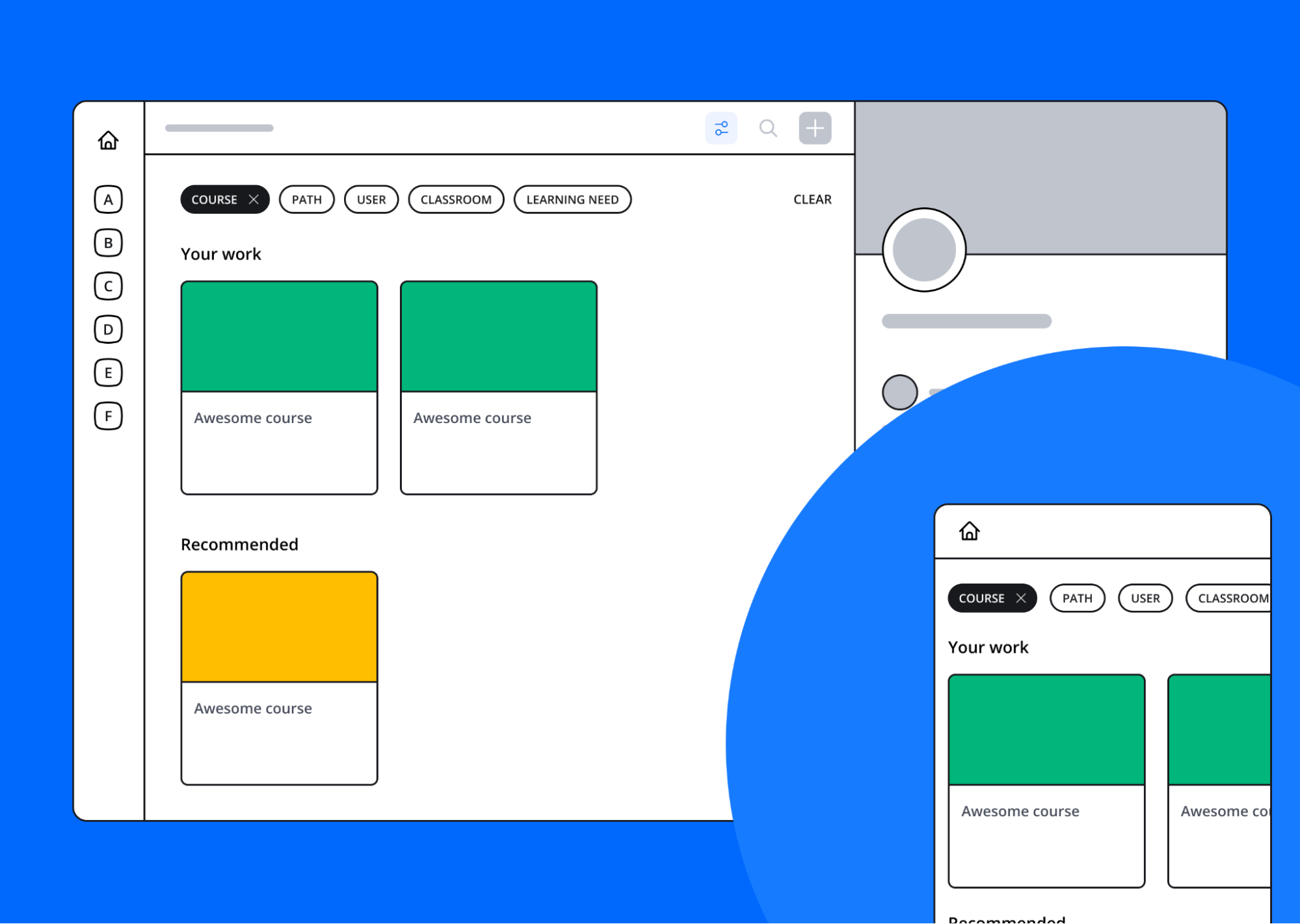
- Can be unselected by clicking/tapping
- "CLEAR" button at the end of the row to undo filtering/sorting options and come back to default view
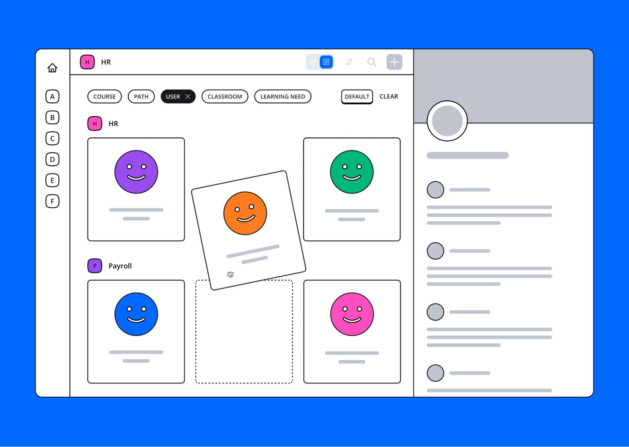
Quick switch between object views:
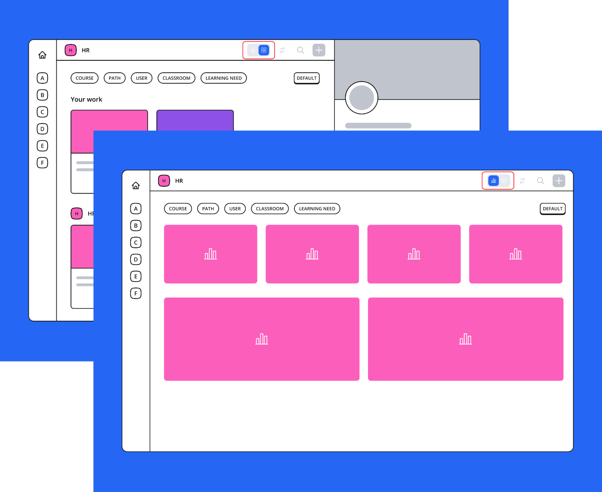
- Default is the dashboard of the group
- Change key parameters of an object, for instance roles for users
- All actions are doubled down in a contextual menu
Focus on key infos, accesses and activity:
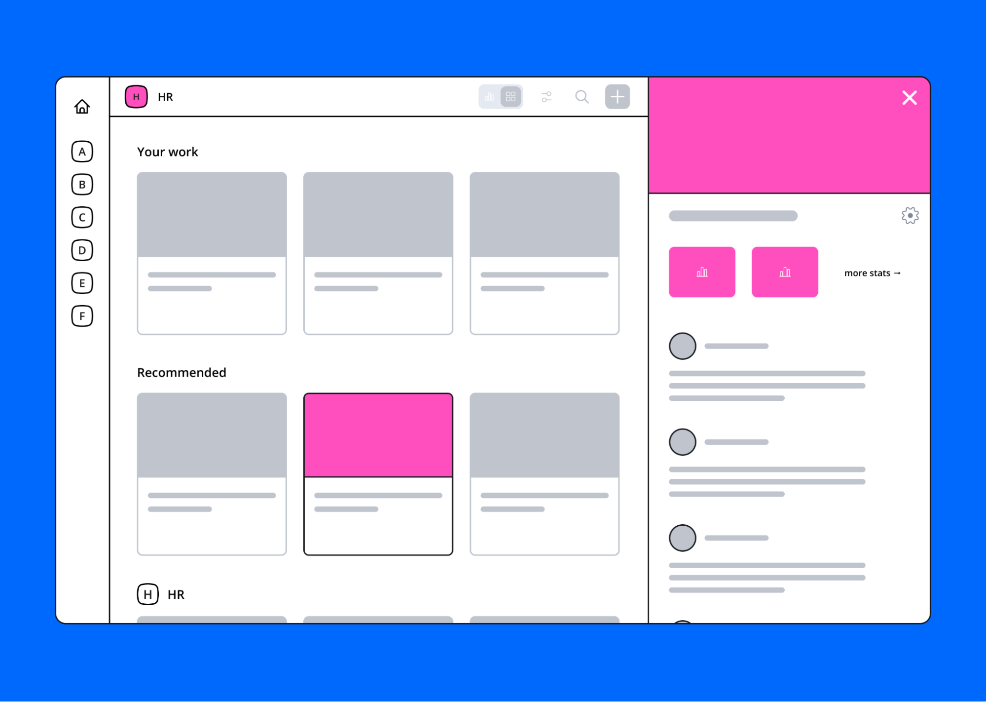
- Display key info
- Show people and their role
- Show key stats
- Quick access: advanced settings and dashboard
- Feed
1. User Tests
After sharing the vision, I started to design mockups with the objective to conduct at least 5 user tests.
The biggest interrogation we had was about the switch content/stats:
-
Add a switch on top of the page “Learn vs Manage”, with a behavior like Airbnb: switch from hosting to travelling. The interface will be completely different if the user is in Learn or stats Manage view.
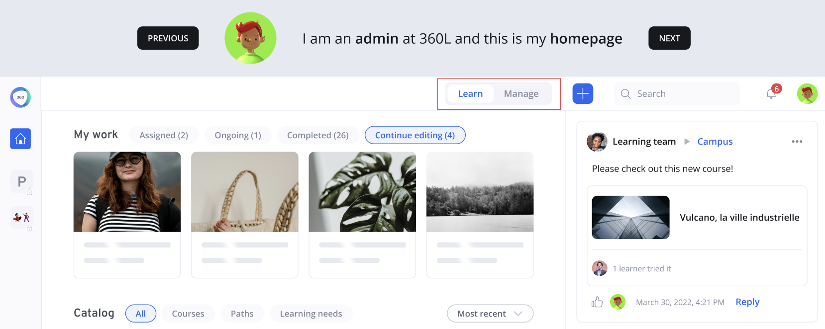
-
Add a switch but at the chips level, which means if the user clicked on the chip “Courses”, he can see the content view and the stats view for this specific object.
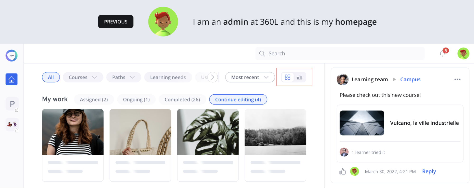
After gathering insights from our testers, 80% chose the 2nd solution: add the switch at the chips level. It was not visible enough, so we decided to move it to the left.
The other solution was not clear, they go on the platform to do many things at the same time, create a course, learn and check stats. It seemed painful to completely switch the view from Learn to Manage.
We also asked some questions about the new chips to select an object and about the Group filter on the left. Users were very enthusiastic and thought it was intuitive and easy to use.
04
Prototype and Validate
1. High Fidelity Mockups
Here are the components created for this new navigation:
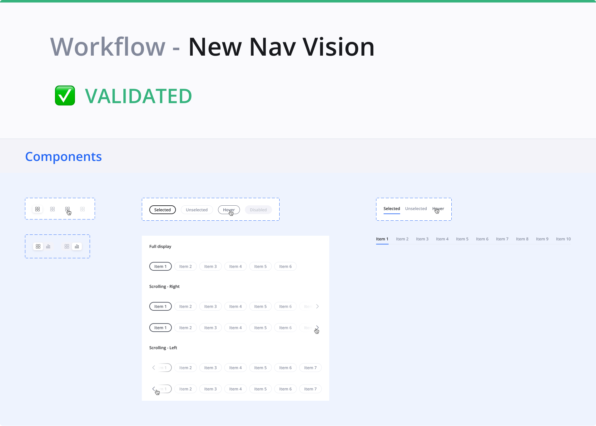
Overall logic to access content
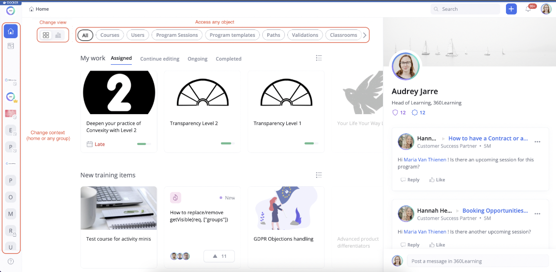
There are 3 dimensions in the new navigation:
- Chip (object like courses, paths…)
- View (content or stats)
- Workspace (home or group)
Objects
- Objects (accessible by clicking on a chip) represent all the tab that were available in the former dashboard
- There are no changes in the visibility rules: a user who had access to a specific tab in the dashboard will have access to the related chip on the home page (so it means no chip for learners)
Views
Views are accessible via the toggle on the right of the chip bar, two views possible:
- Content view will be implemented in the future for all objects and will display the minis of the objects related to the selected chip
-
Stats view: available for every chip, corresponds to the aggregated stats of the workspace I’m in.
- On the Homepage, I can see the stats for the whole platform
- On a group, I can see the stats of the group
- On a chip: display the stats related to the specific chip
Workspace
Tow workspaces possible:
- Home: all the chips display aggregated content from all the groups
- Group: all the chips display the content owned by the selected group (ex: if I’m in the Design group and I select the chip ‘Course’, I’ll only see the courses owned by the Design group)
2. Conclusion
Currently, the new navigation is in production for some clients. As it’s a very strategic project for the company, we are doing A/B testing to collect data and be 100% sure about the new solution.
We created a survey based on the SUS metric (System Usability Score) and shared it with users. We can see that some improvements are still needed, and we’re working on it through qualitative interviews.

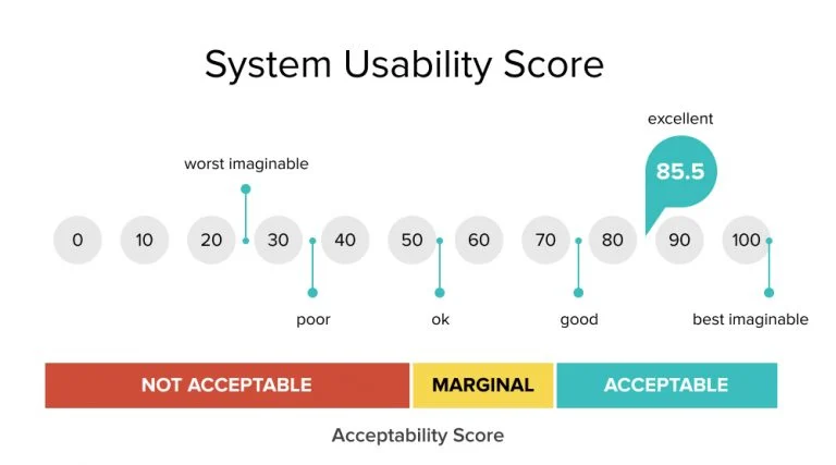
To conclude, I loved working on that topic, it was quite complex due to the various roles and hedge cases of the platform. Also, it implicated all squads and it was hard sometimes to find consensus: communication was key!
