Timeline
1 year
Client
PrestaShop
Deliverables
Design system implementation plan
UI Kit
Content Style Guide
My role
Project management
Communicate & evangelize design
Design kit creation
01
Why this project
Designers shouldn't design buttons or decide colors alone in their corners, and developers across the organization shouldn't code new components from scratch. As PrestaShop scales, the company needs a Design System to allow Product people to work together more efficiently and to deliver a better experience.
Before this project, PrestaShop had lots of Design inconsistencies in production and technical debt. Several technologies were used and squads were working in silos. Here are some examples for icons and buttons:
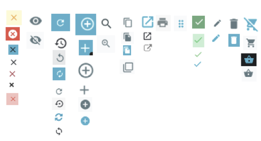
7 icons were used for the “close” function, 4 icons for the “cart” functions, ect… Same for buttons, the UI was not consistent across all PrestaShop products.
The advantages of having a Design system will be to:
- Make the cross-product interfaces consistent
- Simplify developments: available turnkey components & associated best practices
- Gain velocity and efficiency (dev & design): (est. 25%)
- Improve internal communication: process, components, unified naming convention
- Have a centralized, online Single Source of Truth
02
My Role
As part of the Design team, I volunteered to participate in the Design system creation, from scratch. I helped the Design team to:
- Manage the project (roadmap, workshop, follow-up, communication)
- Audit the existing
- Choose the appropriate tool
- Create UI components
- Define an implementation strategy
All these steps will be detailed in this case study. I worked on that project during my spare time, as I was also part of a squad.
03
Managing the Project

Above is an overview of the roadmap for the Design system implementation. We also planned workshops to conduct throughout the project (sample below):
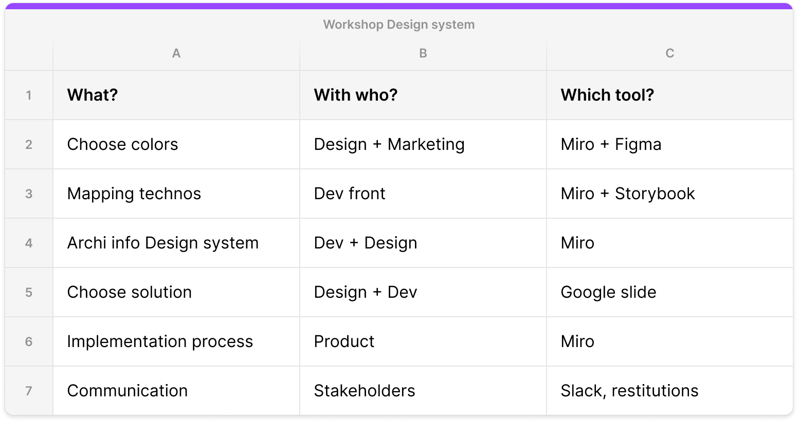
Every week during the weekly design, we shared the progress and answered any questions Designers might have.
Every quarter, I presented a slide about the Design System to the Product team. I worked closely with developers, designers and PMs to align on the implementation strategy and ensure consistency across squads.
We also created a Slack channel “Design System” to ask/answer questions, get feedback with current tasks and communicate about Figma updates and/or releases.
04
Audit of the existing
1. UI Components
The first step was to perform an audit of all PrestaShop components. This part was mainly to highlight the need of a Design system and convince stakeholders to provide us a budget and resources. We clearly showed that it’s time-consuming for Designers and Developers to work while there’s not a single source of truth.
It was quite a long part because PrestaShop has different environments:
- Core Product
- Middle Office
- Add-ons (to buy modules)
- PsX (modules developed by PrestaShop)
- Dotcom (website)
E.g of Core product icons:
It also helped us take decisions on what to keep and what to drop. Some icons were really outdated or not representative of what it means.
2. Mapping PrestaShop environments
The first question to answer was: how do we create a unique Design system, while PrestaShop has so many environments?
We organized a 2-hours workshop with all designers to map the complex PrestaShop environments. The workshop was divided into 5 steps:
- List all PrestaShop environments
- For which users?
- Link users to their environments
- Group and optimize systems
- Discussion about the long term vision
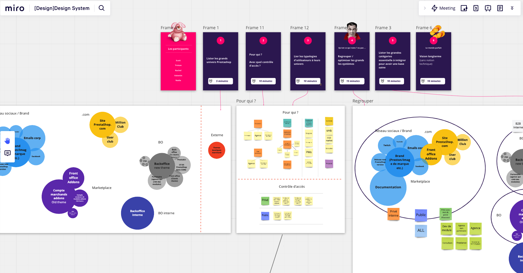
The outcome of the workshop was to categorize environments and come up with a proposition for the Design system long term vision.
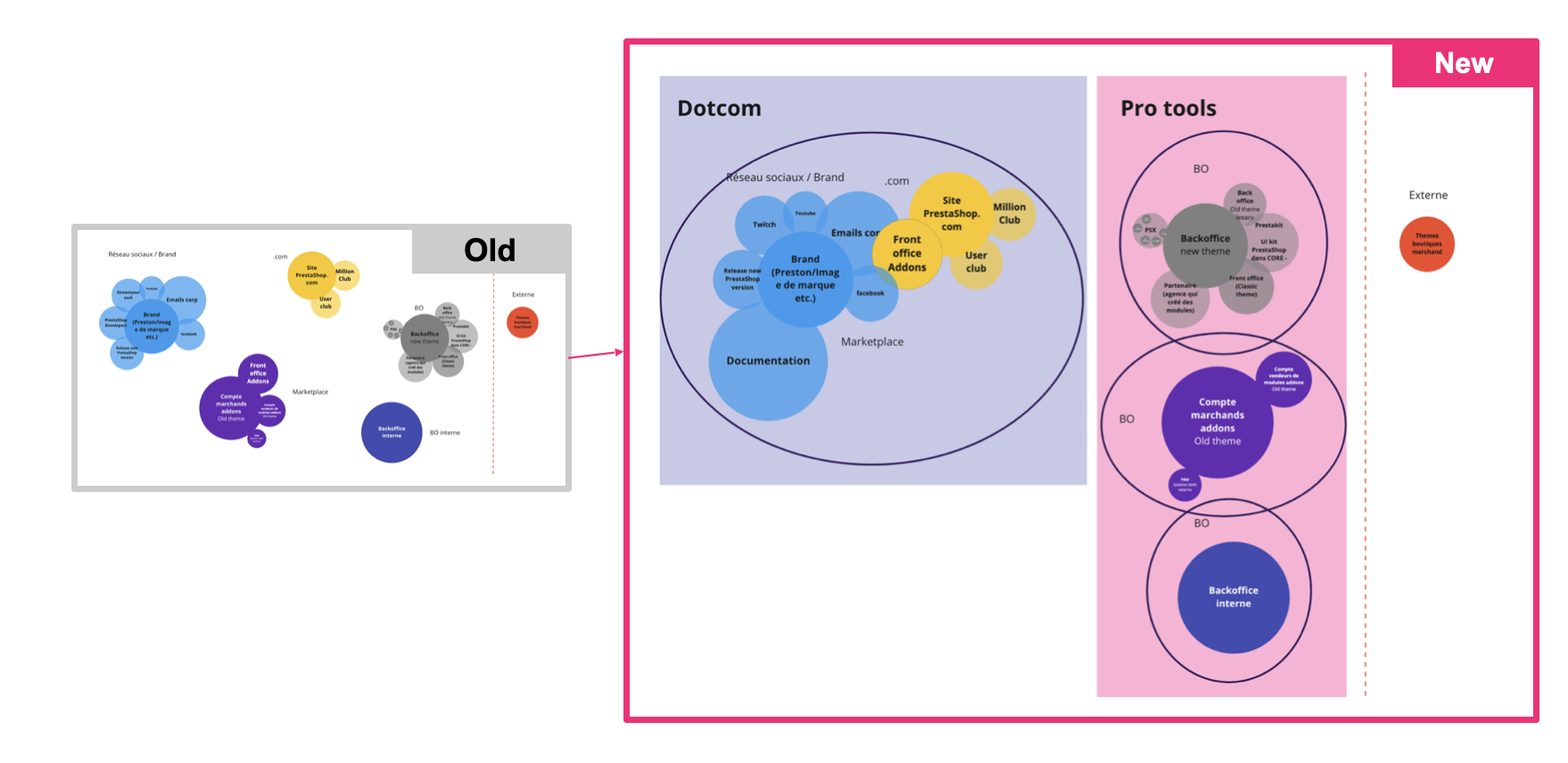
As a result, PrestaShop will have 2 distinct environments: the website (public) and the tools (core, middle office, PsX…).
3. Choose the appropriate solution
We did a quick benchmark to identify which solution will be the right one for the new Design system. The best one will obviously be to develop an in-house solution but it’s time consuming and PrestaShop did not have enough resources at that time.
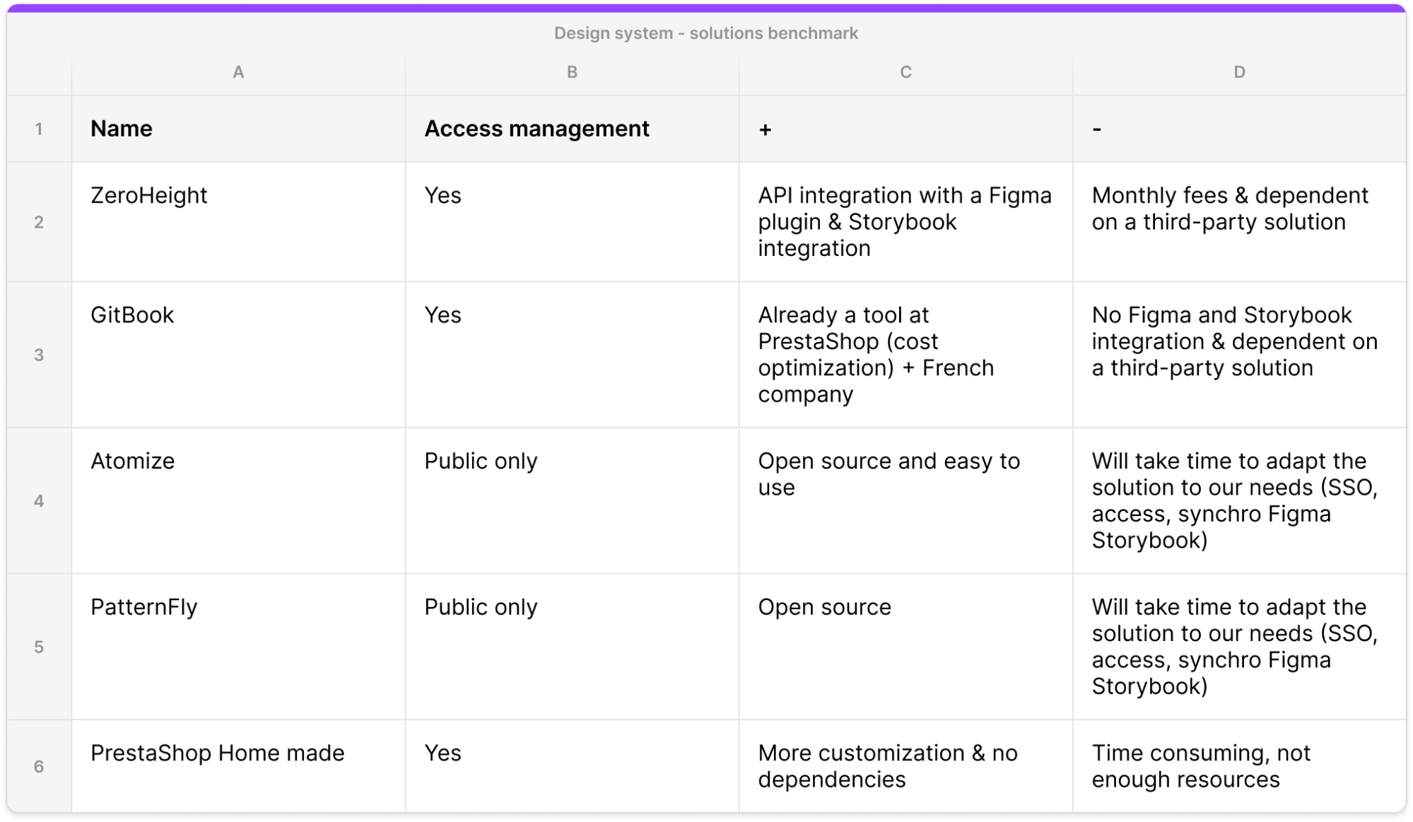
In that context, the chosen solution was Zeroheight because:
- It’s easy to use
- It’s a turnkey solution
- Autonomy on the design side: figma API integration with plugin to send assets directly from figma
- Autonomy on the dev side: Storybook integration, code synchronization
-
Possible customization:
- Access management (public private)
- Password access
- Single Sign-On
- User permissions
- Styleguide analytics
PrestaShop products contain quite heterogeneous stacks, the Design system provides code for all stacks:

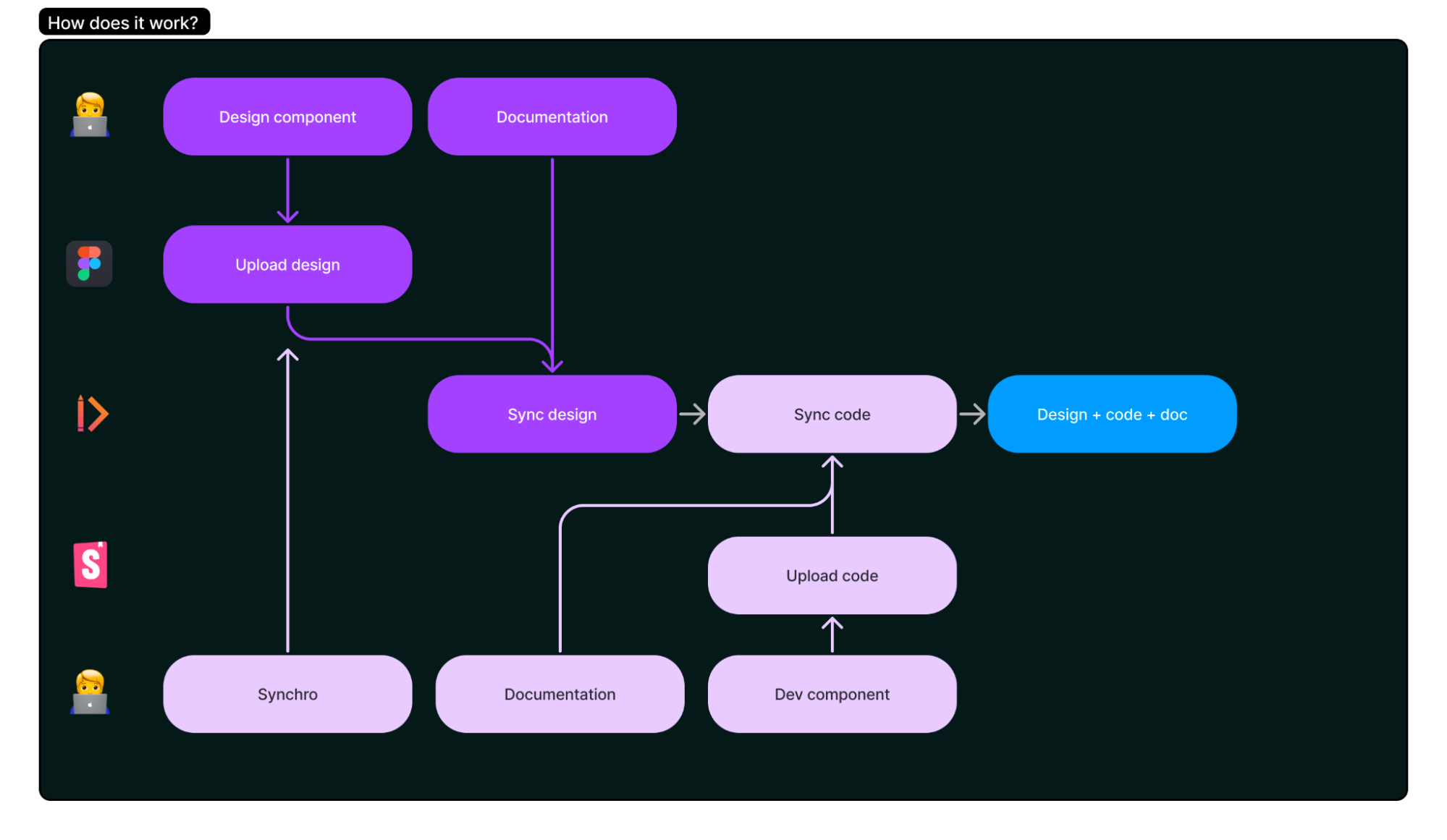
Once ZeroHeight was chosen as a solution, we explained to the product team how we will collaborate together to create components.
Designers will design on Figma, synchronize with developers and upload components on ZeroHeight. While developers will code components on Storybook and upload it to ZeroHeight as well.
To have a fluid process, every component should be documented, and once uploaded a communication to all Designers and Developers should be done.
04
UI Components Creation
The next step was to design the new UI kit for PrestaShop. We divided the work between designers and implemented all components in one single source of truth.
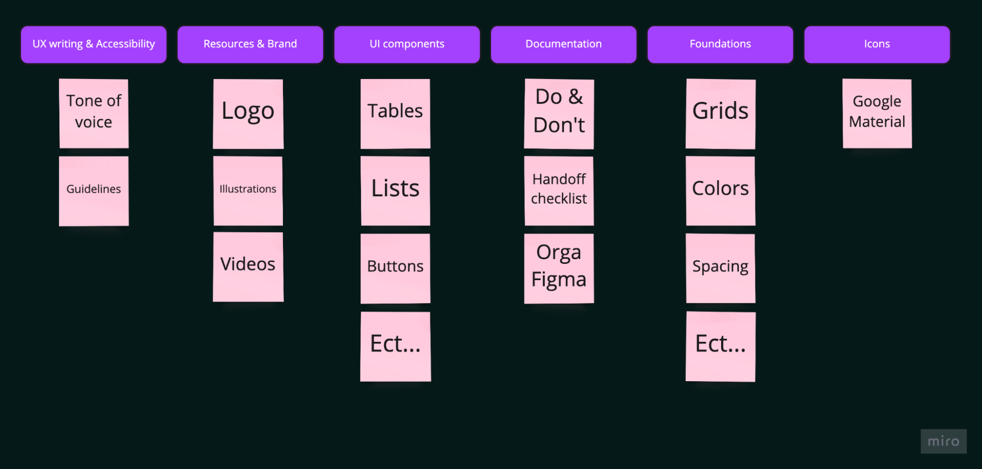
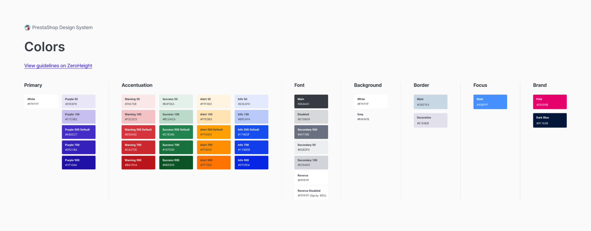
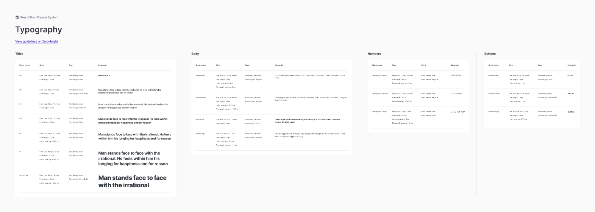
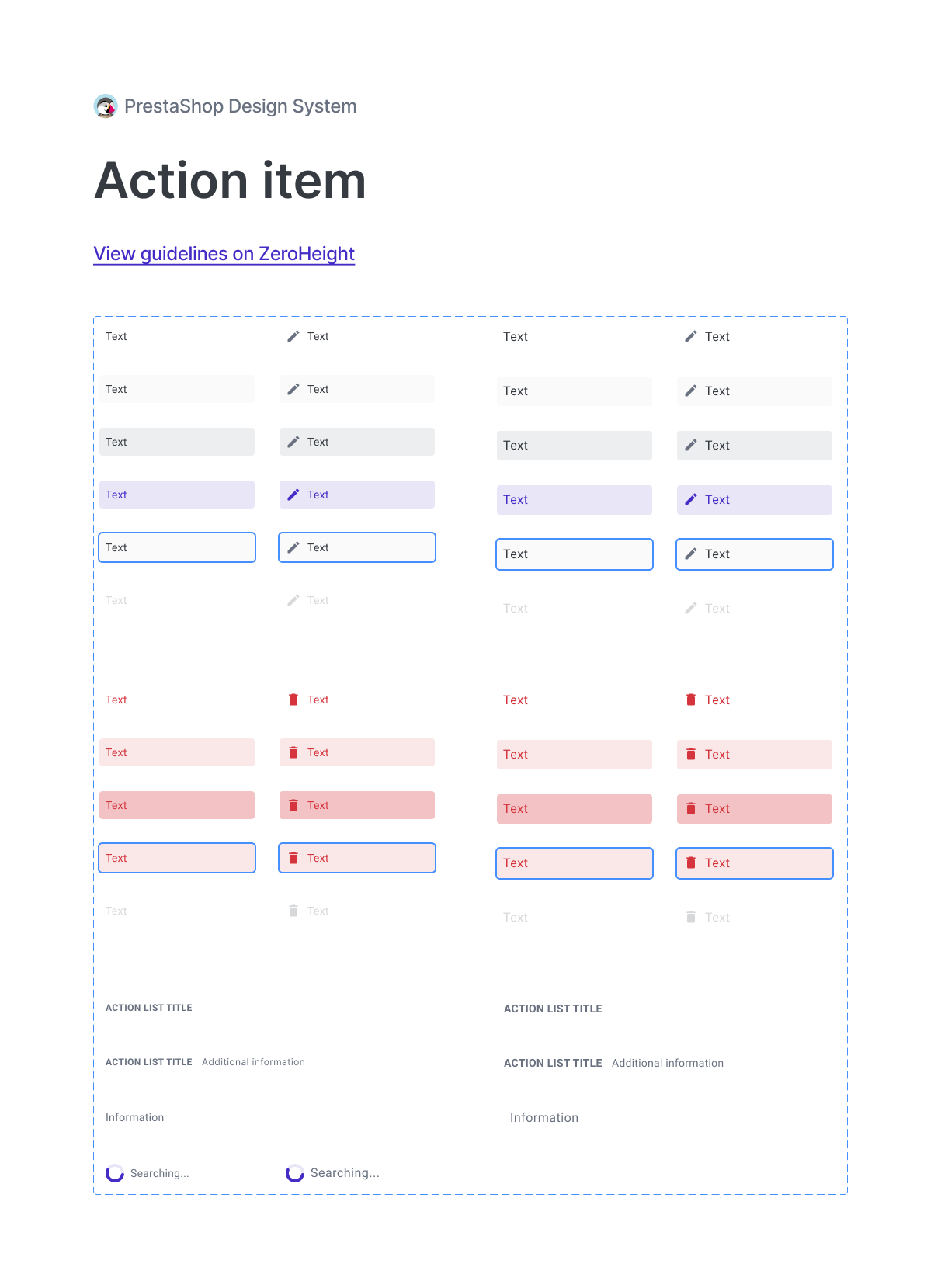
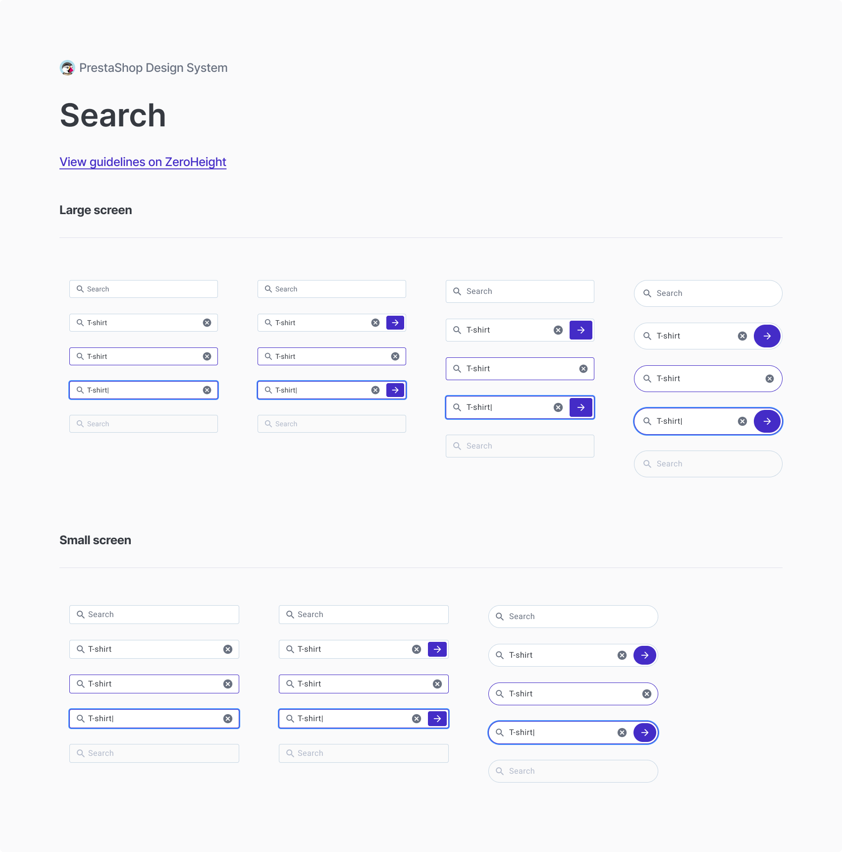
We started with the foundations such as Colors, Typo, Spacing and then we designed real components such as Buttons, Search, Action items. After designing in Figma, we uploaded everything in ZeroHeight.
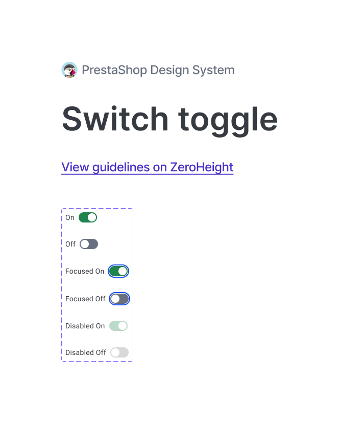
Here is an example of a switch toggle, the Figma file shows all the states and a clickable link redirects users to ZeroHeight.
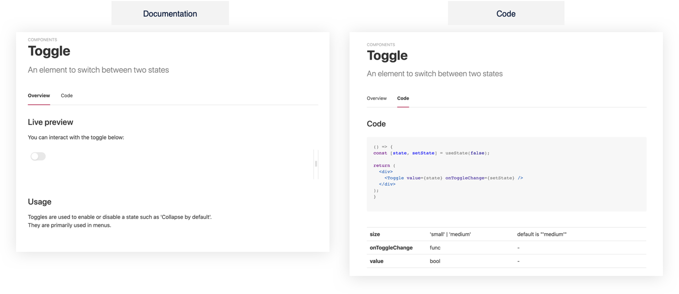
On ZeroHeight, users can play with the interactive toggle and also have a look at the code:
Some examples for foundations (colors, typography):
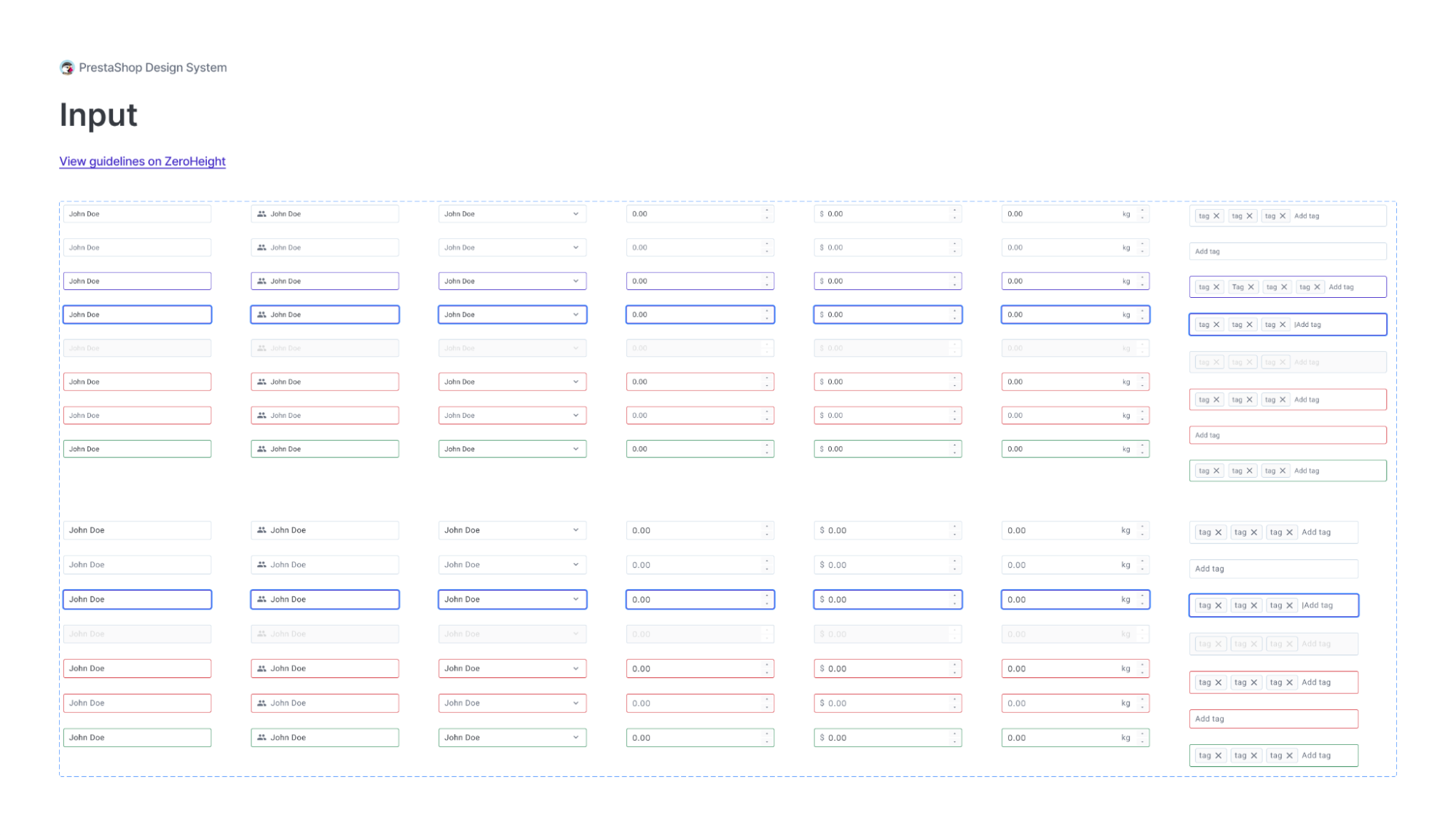
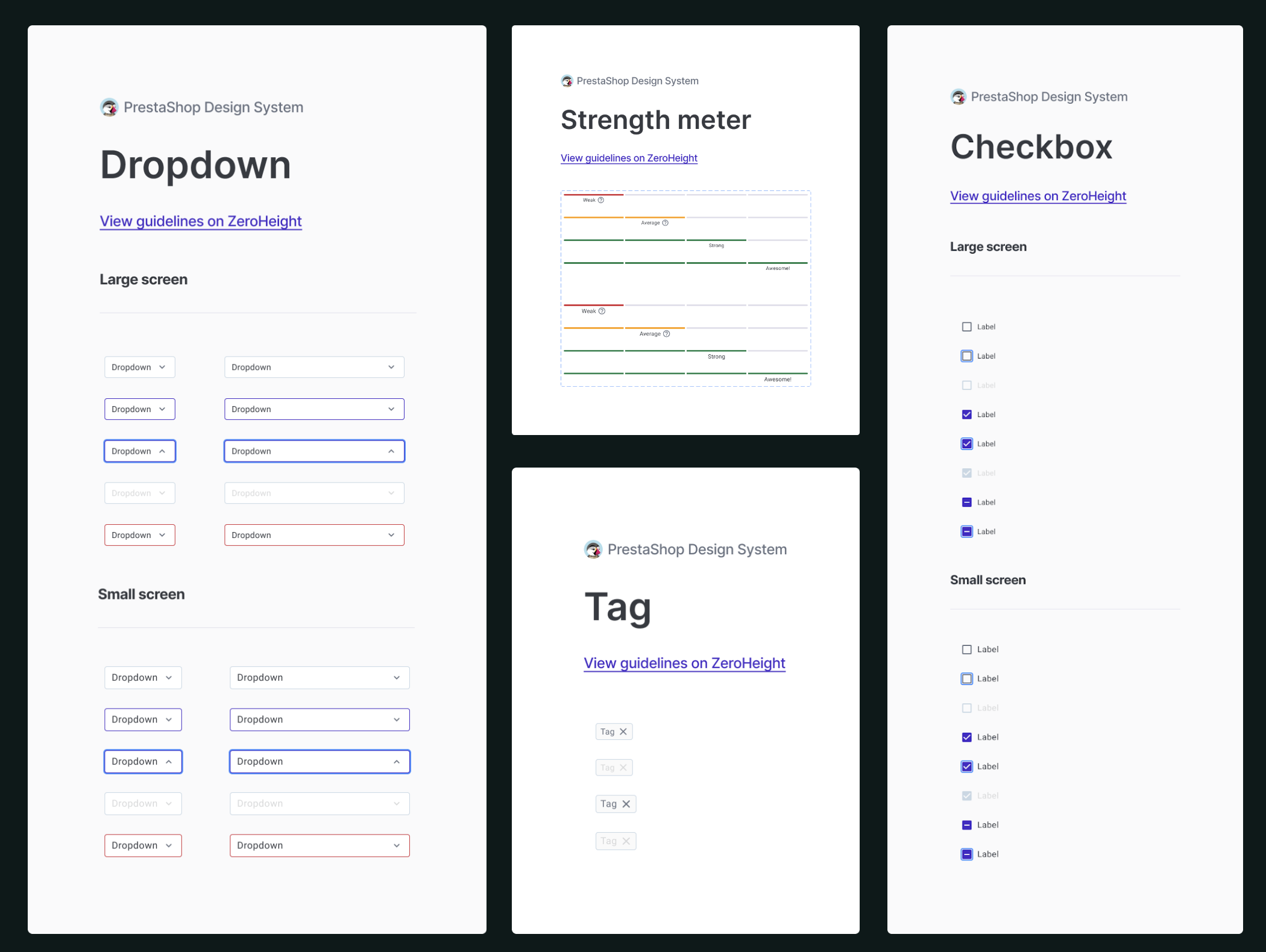
Examples for some components:
05
Next Steps
Before moving forward, we defined some KPIs to measure the success of the Design system:
- Adoption: track how often Engineers & Designers are using the Design system
- Coverage: ad hoc code or design should be rare, we’ll track how often Engineers & Designers are creating a component from scratch or modifying a component from the library
- Shared ownership: everyone in the company should feel familiar with the Design system. Product stakeholders should feel included, Designers should be able to make modifications easily and Engineers should feel like they can contribute to the code
Like any other tech project, the next steps were to Design all components, tests, code, measure ect...
When I left the company, almost all the components were designed and integrated in ZeroHeight and people just started using it.
06
What I learned
Creating a design system from scratch is not easy. It implies a lot of people in the company and it’s time-consuming. Also, It’s difficult to convince stakeholders that it’s not a “nice to have” but a “must have”.
I learned that good communication is key, and it needs to be pragmatic. E.g; “It will save us X€ because Developers and Designers will spend Y less time per month.”
I also learned that a good design system is a very precise work and needs justification and clarification for every decision.
E.g: Why do we choose this icon for this action? How do we use it? In which context? When can’t we use it?
In conclusion, the project was such an interesting project to work on. I know now how to manage a project in a complex environment, how to design clean components, how to evangelize and communicate around a touchy and new subject that is emerging in the Tech industry, and I feel comfortable doing it again.
